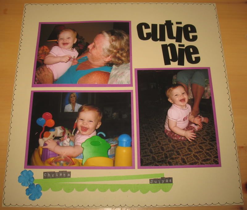
 Did this one for Color Combo Challenge #86. The background paper looks more yellow in real life. It's not my favorite layout and I wish I would've done what all the designers over there did and used
 plain cardstock as the background paper. Oh well. At least I got the pictures scrapped, right?

2 comments:
Getting the pictures scrapped is definitely the priority Heather! You are super quick again this week, great job!
Wow quick off the mark! Love how you have used the bolder colours minimally. Such fun photos too :)
And plain cardstock background is quite a rarity for me, I love pp so much!
Post a Comment